

Last Friday, Virginia Tech and Nike rolled out the results of a uniform revamp that will affect all sports at Virginia Tech, starting in the fall of 2016.
The revamp -- it's not accurate to call it a "rebranding" -- was talked about by Athletic Director Whit Babcock in our interview from February. Specifically, Whit said:
Nike, at no charge to us, they pick about four or five schools each year that are their schools, and they go in with what they call the Nike Graphic Identity Group — GIG. They come in and they pull all your uniforms, and they take pictures all over campus. And what’s amazing is how, over time, there’s creep away from your logo, the colors start to vary a little bit, one coach in one sport wants to use cursive, the other wants to use this, and before long all your consistency is gone.
So the Nike Graphic Identity Group comes back in, and they clean up your wordmarks, they get the colors back right, they changed our font to be more consistent …Nike can give you some off the wall stuff too, and they can present that, but it’s always up to the school to pick what we’ll accept.
So this also took place back in October [2015], and what will now be unveiled later this year and into the fall is more consistent colors, more consistent fonts, our own Chicago maroon, Hokie maroon type thing, all the same numerical fonts, all the same script and it’s like, “Let’s bring this back, and we can have some flash, but let’s bring this back to class and a tight, clean look.”
The results of the work between Nike's Graphic Identity Group and Virginia Tech were introduced last Friday, in a release that received less hype than one might expect. Googling "Nike Virginia Tech" and "Virginia Tech Nike Branding" produces very few articles on the subject, including none from hokiesports.com or vt.edu.
Hokiesports.com did, however, announce the launch on their Twitter account (and possibly on other platforms; I didn't check.)
https://twitter.com/hokiesports/status/723859087306289153
Note that they call it a "brand refresh," not a "rebranding."
Clicking the link in the tweet -- http://www.hokiesports.com/brand/ -- gives you background on what went into the brand refresh.
Let's do what most people want to do: just look at the pictures. We'll start with the Olympic sports, then move through baseball, hoops, and finally football.
The "New Unis" photos below are from the hokiesports.com branding page linked above. The "Current Unis" photos are also from hokiesports.com, with the exception of the men's basketball and football photos, which are by TechSideline.com photographer Ivan Morozov (click here to view Ivan's web site, jam-packed with photos of Virginia Tech athletics and the Virginia Tech campus).
Lacrosse

In what you'll see is a recurring theme, the old and new unis are very similar, with the updated fonts being the major difference, as well as orange numbers trimmed in maroon, instead of vice versa.
Volleyball

The changes here are similar to the lacrosse changes: very similar unis, with updated fonts and orange numbers now trimmed in maroon.
Softball

There's a big difference here, though I don't attend enough softball games to know if the current unis shown here are representative of the style and types of fonts generally used on VT softball uniforms. Baseball and softball tend to have a lot of variant uniforms, and I wonder if that will continue, or if the uniforms for those programs will be more "standard," similar to the new orange uni shown on top, with colors swapped in and out.
Speaking of baseball ....
Baseball

The new uniforms are a much cleaner look. The word "bland" might actually apply here. But again, baseball tends to have a lot of variants, and baseball is one of the sports that is likely to use cursive script Hokies on their uniforms. So we'll see if the uniforms used by the baseball team all look like the one shown on top, with just colors swapped in and out, or if there are any variants.
Women's Basketball

This is a nice look that borrows heavily from the current uniforms, with -- once again -- the major differences being in the fonts. The shorts look nearly the same.
The LAX and volleyball uniforms shown up above are sharp, and so are the basketball uniforms. Let's take a look at the men's basketball uniform.
Men's Basketball

Very nice. Just like with the women's uniforms, the pants look nearly the same. When you look at the current men's and women's uniforms, and also look at LAX and volleyball above, you see one of the things the brand refresh addressed: all white uniforms now feature orange numbers outlined in maroon. Previously, the color of the numbers on the white uniforms varied; some were orange, some were maroon, and fonts were all over the place.
Now, the biggie.
Football

Hmm. Not very different at all. (Stop me if you've heard this one...) The font is different. And the V-neck collar is wider. But other than that ... (drumming fingers on table, looking around) ...
The hokiesports.com branding page included just a few photos of most uniforms, but a bunch of photos of football uniforms. Here are most of them -- click for a larger version where you can see more detail.

So how do we here at TSL feel about the "new" football uniforms? Well ... we don't speak for all Hokie fans, of course, but we're not fans of the retro shoulder stripes. We were hoping those would go the way of the Dodo with the Nike brand refresh. But no luck ... it appears we're stuck with them.
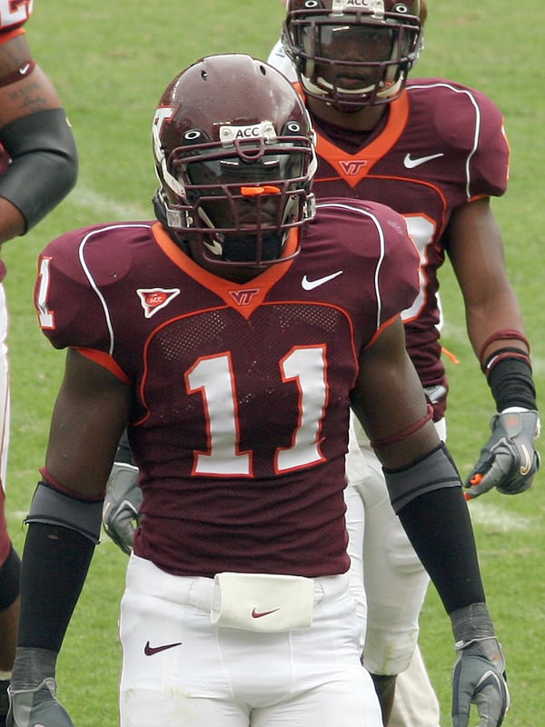
Maybe it's just maudlin sentimentality, and it might have something to do with the guy wearing the uni, but it's hard to get better than this:

The mid-2000s unis were almost as cool ... ditch the overwrought piping on this uniform, and it would be perfect. (It's worth noting that Xavier Adibi -- man-crush alert!! -- made EVERY uniform he wore look fantastic.)
For Virginia Tech sports as a whole, we think the uniforms got an upgrade. Nothing major, but a nice, as they say, refresh. The upgrade for basketball was slight, and football just stayed on the shoulder stripe treadmill, a feature we wish they'd retire.
It's hard to really poll you on what you think, because the answers could vary widely depending upon the sport, but we'll try a simple poll: what do you think of the brand refresh? Pick the answer that most closely represents your opinion.