

For those of you who like reading about the motivations and machinations behind web site design, this article is for you. But it also contains some other important information, so even if you don't like reading me droning on about site format changes, be sure to check out the sections that talk about other things, ESPECIALLY the section about ads and ad serving.
Another New Site Design? Again?
If you're keeping track, this is our third major redesign in the last four and a half years. In January of 2012, after many years of being relatively low-tech and simple in our approach, we introduced this poorly-received (to put it nicely) site design:
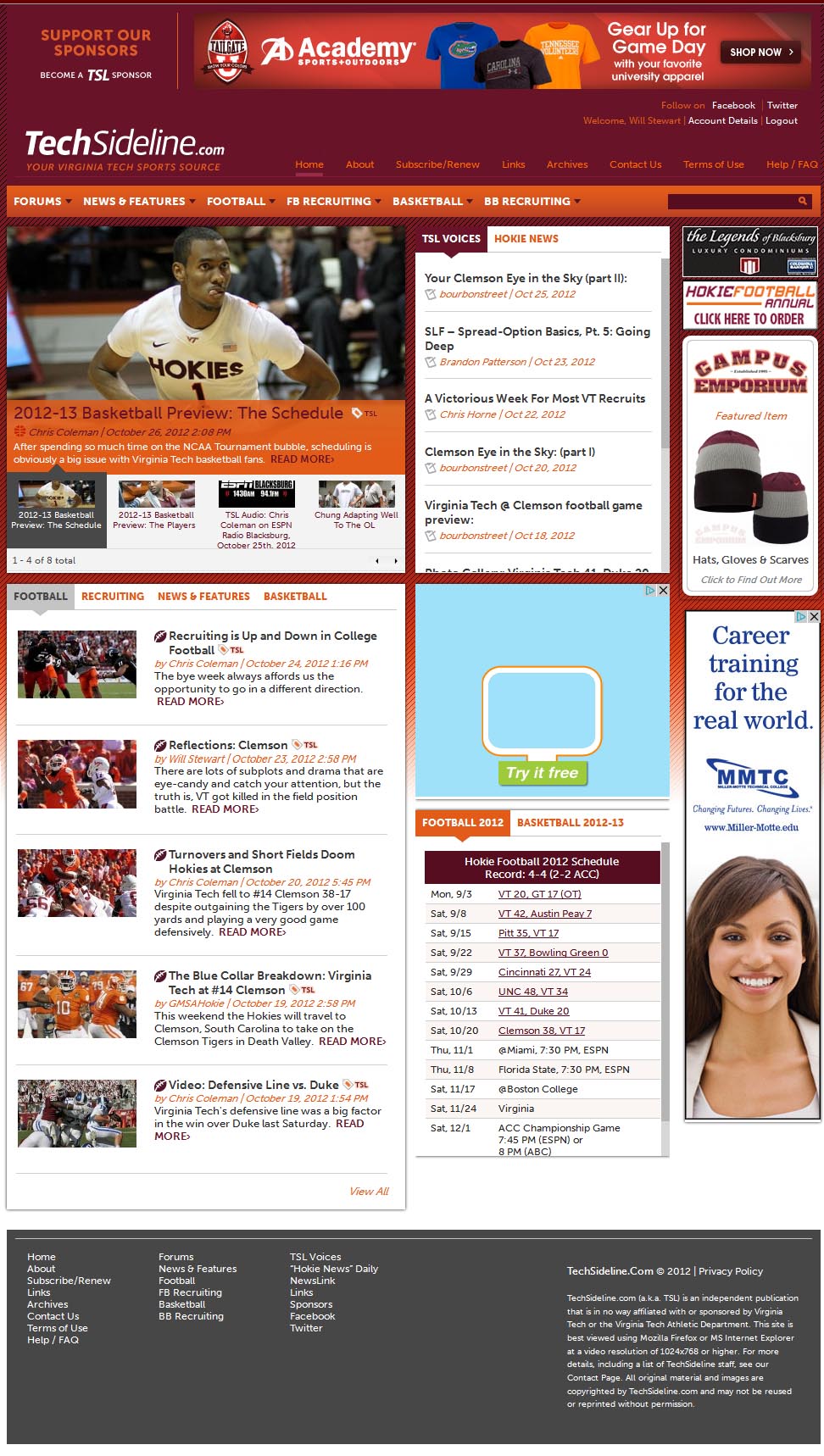
The design was disliked mainly due to a botched attempt to switch to vBulletin boards (without a true vB format), but the delivery of articles and the home page format caused problems for a lot of our readers as well.
Most of the stuff we did on the home page, including a slideshow of featured articles and tabbed displays, was widely in use on the Internet at the time but many of our users, who were used to a simple, sequential listing of articles, were confused by the new layout.
That design also didn't have a mobile format, at a time when smart phones were starting to take off.
So almost immediately after launching that design, we set about replacing it with a new site design. At the end of August 2013 we launched a version of the site that served us for almost three full years, this one:

At that point in time, we also reintroduced the old-style message boards. About five months later, in January of 2014, we killed the vBulletin boards entirely, two years after introducing them.
The August 2013 site design also formatted itself properly on mobile, so it had that going for it. It was simpler and functioned better on tablet and mobile, but the instant we launched it, it looked dated.
Every other web site seemed to be going with splashier home page graphics, larger fonts and images, and a cleaner design, so even though we had just introduced this version, we already looked like we were behind … again.
Before we could fix that problem, though, we needed to make the boards better for mobile. We spent some time redesigning our boards to display differently on a phone, and while we were at it, we introduced some plus-minus voting, star ratings, and rankings for posters.
Then we set about a new design for the site. Working closely with John J. Donna, a programming consultant to Richweb, our site hosting firm, we began putting together a site that we hope will serve us for years into the future. That's what we launched a few days ago.
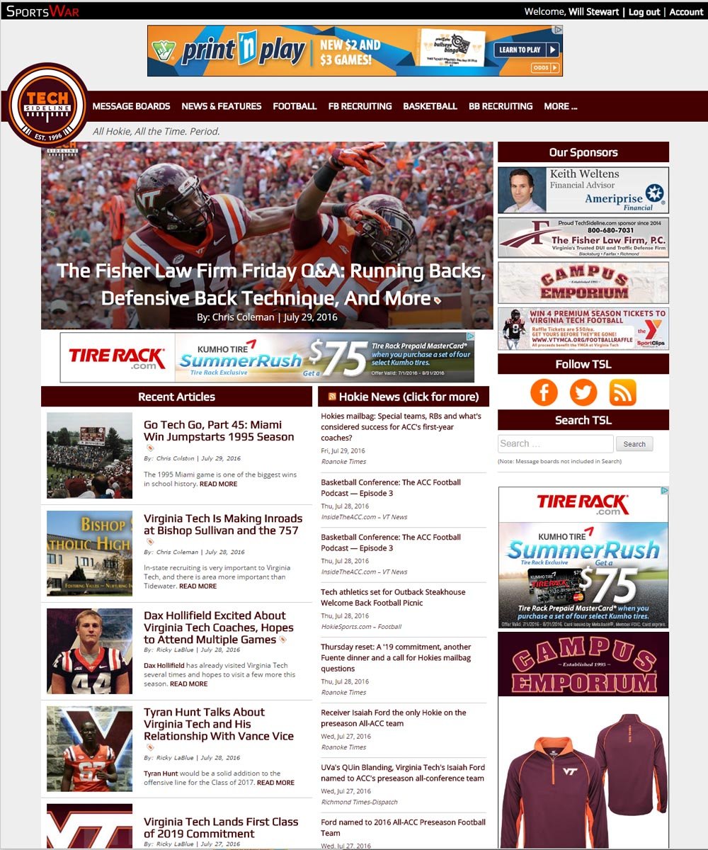
Here are the advantages of the new design, as we see it:
Cleaner, Leaner, More Modern Design
Listen, we're not a crack graphic design team here at TSL. We have access to people who are, but we didn't call them in on this project. And design is a matter of personal taste. But here are our thoughts.
We love the splashy home page graphic/photo, and the graphics and blocks of content are bigger in general. This has been the trend on the Web for a few years now and we finally caught up.
Circular logos seem to be a thing on the Interwebs these days, and the new design enables us to use a circular version of our logo that was designed for us by former Virginia Tech running back Kevin Jones and business partner Alex Barrette (of JoBa Design) in the summer of 2015.
We also make wide use of a font that we think looks more modern. It's the "Play" font, for those who are curious. Inside articles and pages, we use Open Sans.
We'll admit that this was not an in-depth design process with prototypes and numerous iterations that were argued over endlessly. It was more of a, "Hey, let's put that there," and "Hey, let's use this font," design process. We think that the dartboard method of design, or throw-spaghetti-against-the-wall method of design, worked pretty well in this case. Meanwhile, designers everywhere cringe. (Apologies, KJ and Alex.)
The site is also leaner and faster. Prior to the redesign, for example, the home page was 1,900 lines of HTML code. The new home page is about 1,150 lines. That efficiency extends throughout the entire site, not just the home page.
Better Use of Ad Serving Technologies
Ah, now we're down to the nitty-gritty. Another advantage of the new site design is that it enables us to better leverage available ad technologies.
Here's how the devices used to visit our site have changed in just six years:
- June 2010: 95.2 percent desktop, 4.8 percent mobile
- June 2016: 55. 6 percent desktop, 31.6 percent mobile, 13.8 percent tablet
Neat, huh? There's just one problem: we averaged five ad spots on desktop, two or three on tablet and one on mobile (phone).
So as the flight to mobile was well underway, we were hemorrhaging ad impressions, due to fewer ads being served on table and mobile.
To solve the ad impression/revenue problem, we have partnered with a company named Sports Publishers Group. SPG worked with us to introduce more ads to the mobile platform, and to leverage ad technologies like using "sticky sidebars" to keep ads in view, then refresh them to increase impressions. They also helped us with strategies to place ads in new and different places. You'll notice a few ads serving between threads on the message boards, for example; that's new. We also now serve an ad at the bottom of our mobile page views.
In choosing to introduce new ads, we did our best to make them unobtrusive and avoid compromising the experience for people visiting the site.
A Few Important Notes About Ads and Ad Serving
There's always a risk with serving more ads, though. Clutter is the main risk and trashy, poorly-programmed ads sneaking through is another.
First things first: we do not like serving popup ads, takeover ads or video ads (especially video ads that auto-play, with sound). We only want to serve non-obtrusive "display" ads, which consist primarily of pictorial ads or simple animation -- no flashing, no videos, no popups, etc.
In working with SPG, they have honored our wishes by setting up ad serving campaigns with ad networks that exclude those types of ads.
But the tricky thing about ad networks is that advertisers often abuse the networks or skirt the rules. Sometimes it's intentional and sometimes it's just a mistake, but when uploading ads, advertisers will often (for example) upload a video ad and classify it as a non-video ad … which means it gets served to our site when it's not supposed to.
Since launching the new format, we have been experiencing more problem ads, and it's going to take us some time, working with SPG, to iron out issues and get the ads settled down. Please be patient while we work through any issues caused by the launch of a new site and working with new ad networks.
That's everything I have to say about our new design, except for one more thing...
Credits
- Site design: Will Stewart, TechSideline.com, and John J. Donna, programming consultant to Richweb
- Site programming: John J. Donna with support from Richweb
- Site hosting: Richweb of Richmond, Virginia
- Site logo design: Kevin Jones and Alex Barrette of JoBa Design.